Thursday, December 8, 2011

Cabinet of Curiosity

For our final project in studio, we were required to work with first year students and their designs to come up with our Cabinet of Curiosity design. Each of the 2nd year student had 3 first year student's design to work with. It was about a week's project that couldn't see the finishing result of the first year in order to create the best design for our cabinets, instead, we were only able to work with what their initial ideas and design were and went from there.

I believe if I had another week to work on this, it would have been a lot better since the progression of the design was moving in my favor, I just didn't have enough time to make it a final and clear enough one. Overall, I'm happy with the idea production of it in such a short time span. Below is my Cabinet of Curiosity - The transforming Hexi.

Wednesday, November 30, 2011

SIGNAGE


For our final project in Visual Communication 211, we had to create multiple signage in our office space. Above is an example of one of the signage I made for the conference room. We also had to produce an actual sign from one of our designs and I also chose the above image to create as well.

Below is a few examples of the work in my Signage project:


Tuesday, November 1, 2011

Discovery of Lights

After talking with Scott about some lighting fixtures and how it could manipulate the space, we (IOB group) thought about some artificial lighting that could be in play to enhance the visual effect of our design. We thought about a soft light fixture that would expand throughout the space, capturing the essences of our octagonal shapes. The play of shadows from the light would also generate a different texture on the walls and flooring that would lead people into discovering certain elements at a certain time.

As we also discuss about artificial lighting, we also talked about natural lighting. Creating a space with natural lighting will have a different effect. Giving enough lighting without overpowering the space is crucial since we're dealing with special needs of many people.

Monday, October 24, 2011

"How To Poster" Examples

Below are some examples of "How To Posters." I chose the theme of HOW TO WASH YOUR HANDS because hygiene is important. The first two sets are visual demonstrations along with text, but are both lacking in colors to attract the eyes. They still do their jobs of presenting to you how to wash your hands properly, giving you step-by-step along with a photo.


These next two are exactly identical to the first, only that they provide extra colors and visual effects to draw attention to them. I believe this has a better effect in presenting itself and getting the target audience to do as instructed.


All photos are taken from the web. Clicking on the photo and then clicking on original source will lead you to the exact location via the web.

Wednesday, October 19, 2011

2 Point Perspective: Strawberry Concept


This was for the strawberry concept perspective that I had to do for class. After uploading the photo up, I noticed that one of the organic shape was figured wrong, so I digitally corrected, using a different color to show the correction made. The layout was actually in a different format, but I liked how this one look better.

Photo Studies

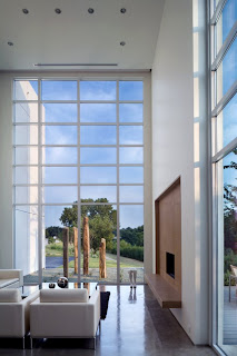
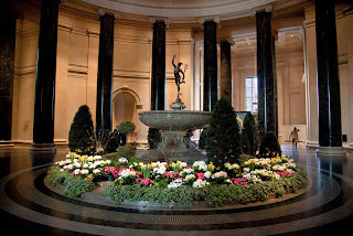
For class we had to do a series of lighting photo studies.

The first two are examples of interior photos that shows reflections on the floor -
I chose these because they were just fascinating and some of which I took while I was in DC.


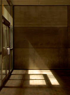
The next two photos are examples of vertical reflections. In the first one, the lighting from outside creates a side reflection near the doorway along the window. The second one I thought was cool because it was like a twin building because of the reflection of the angle.


These next two shows shadows entering into a space. I chose them because they each tells a story of their own. They each create a certain mystery to the image.


The last two are examples of artificial lighting. I chose the first image because of the fancy interior layout and how the the lighting created many different shadow textures. The second one is a photo I took of the Rotunda in the West Wing of the National Gallery of Art in DC.