Monday, October 24, 2011

"How To Poster" Examples

Below are some examples of "How To Posters." I chose the theme of HOW TO WASH YOUR HANDS because hygiene is important. The first two sets are visual demonstrations along with text, but are both lacking in colors to attract the eyes. They still do their jobs of presenting to you how to wash your hands properly, giving you step-by-step along with a photo.


These next two are exactly identical to the first, only that they provide extra colors and visual effects to draw attention to them. I believe this has a better effect in presenting itself and getting the target audience to do as instructed.


All photos are taken from the web. Clicking on the photo and then clicking on original source will lead you to the exact location via the web.

Wednesday, October 19, 2011

2 Point Perspective: Strawberry Concept


This was for the strawberry concept perspective that I had to do for class. After uploading the photo up, I noticed that one of the organic shape was figured wrong, so I digitally corrected, using a different color to show the correction made. The layout was actually in a different format, but I liked how this one look better.

Photo Studies

For class we had to do a series of lighting photo studies.

The first two are examples of interior photos that shows reflections on the floor -
I chose these because they were just fascinating and some of which I took while I was in DC.


The next two photos are examples of vertical reflections. In the first one, the lighting from outside creates a side reflection near the doorway along the window. The second one I thought was cool because it was like a twin building because of the reflection of the angle.


These next two shows shadows entering into a space. I chose them because they each tells a story of their own. They each create a certain mystery to the image.


The last two are examples of artificial lighting. I chose the first image because of the fancy interior layout and how the the lighting created many different shadow textures. The second one is a photo I took of the Rotunda in the West Wing of the National Gallery of Art in DC.


Saturday, October 15, 2011

Assessment of Group

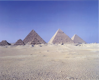
In class Friday, we got into our project groups and was told to choose a photo that we believe our group represented. The following images reflect that of what the IOB group believe we are at the moment.

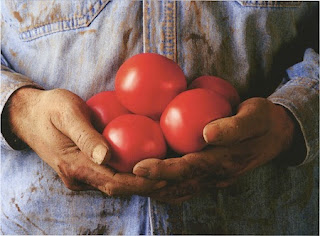
These first two images represent a wholeness of the group. The two that chose these two images believes that the group is together the way a group is suppose to be. Well balanced and supporting each other was also stated, from the second photo.


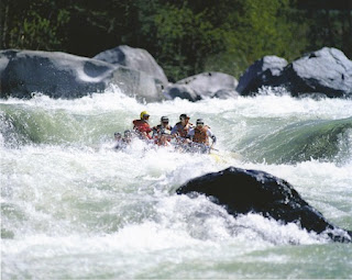
These next two photos represent a struggle within the group, whether it's with one another or from outer force, we're still able to maintain the composure necessary to keep going and help each other out in tough times. We might have different opinions at times but everyone continues to work hard for the end goal - together.


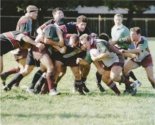
The next two shows a similarity in what the two people that chose these said. They believe that the groups dynamic is based upon 3 main group leaders and the rest of the groups members are following them and supporting them.


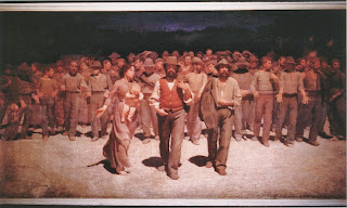
The last two shows that we're not quite 100% together within the group, but we're working on it. The path that these two shows, if things works out the way it's suppose to, then the puzzle will be fully complete and we'll be as one, while the path of the trees leads to one point in the destination, our main goal for this project.

Thursday, October 13, 2011

Office Space Composition.

Below is the final composition of my office space I designed. The theme was Strawberry, hence the pink theme. I didn't want to go with red as that would have made the space too dark for a first entrance into other spaces. The walls have a soft tan color as I thought this was appropriate for the space. The layout consist of a furniture plan, 2 elevations, and 2 perspectives of the interior.


Business Idea Contest

There is this business idea contest on campus, and I'm currently thinking about entering. I've always been good when it comes to business and this seems to be something quite fun. The top winner also receives $1,000 so that definitely could do quite a few things. You have to come up with an original idea, and if you are selected among the 20 finalist, you have 2 minutes to pitch your ideas to the panel of judges. Talk about do or die. This might even motivate me to get back into the school mode that I've lately feel distance from. Either way, this should be an interesting opportunity that I definitely don't want to miss out on.

Semester Progress

As the semester is already half over, I feel as if maybe I'm starting to slow down. My overall motivation has died out, and just a lot of stress has build up. I'm currently maintaining 3 As and one I'm not so sure of. I know I can do better, but I don't know what is holding me back in that class. But, I will make sure I pass everything; there is no excuse not to. I just need to apply myself for the next month & a half and do well. The final stretch is almost here, I just need to hold on. Sometimes I'm excited for class, other times I'm just over it. Typical college student life, I suppose. Hopefully I can keep my mental focus up and finish this semester out the way I had intended to.

Studio Project - Elements & Principles of Design

As the group project is moving forward as it should, it really has narrow down a bit more towards what we are focusing our attention on. We demonstrated a proportion & balanced of chaotic hexagon shapes design for texture. The form it will take will still depend on the final development of this project as we will continue to work on it. The shadows it cast as of the affect from the lighting of the shape really is quite intriguing, and depending on the time of day, these hexagonal shapes will illustrate a different system of rhythm onto the surface of which it is placed. Overall, we're happy with the design we have completed thus far, and as we have a clearer mindset of what to do, this will only help us to emphasize the importance of our shape in regards to the IOB building and its meanings. The colors we have also selected has a warm & inviting notion to it, as to allow visitors to feel as if they also belong in the place, since IOB has strong family bond towards one another. We will try to explore other colors this week and see where that could also lead us.

Photoshop Composition