Showing posts with label IAR211. Show all posts

Wednesday, December 7, 2011

Wednesday, November 30, 2011

SIGNAGE


For our final project in Visual Communication 211, we had to create multiple signage in our office space. Above is an example of one of the signage I made for the conference room. We also had to produce an actual sign from one of our designs and I also chose the above image to create as well.

Below is a few examples of the work in my Signage project:


Monday, October 24, 2011

"How To Poster" Examples

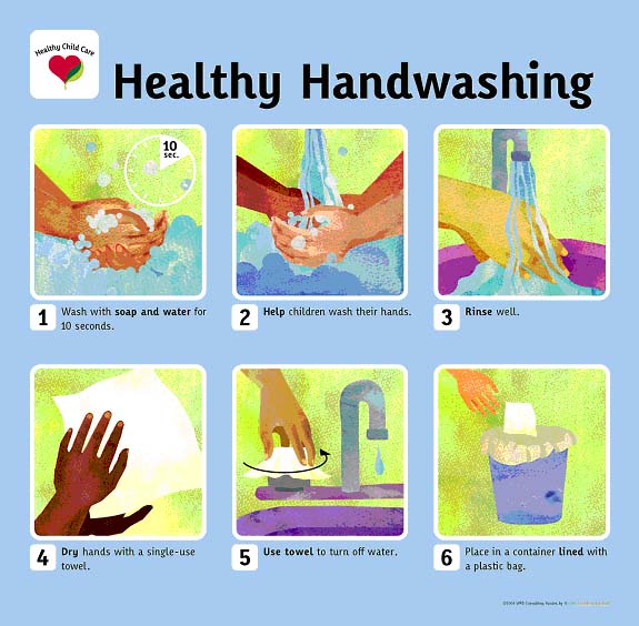
Below are some examples of "How To Posters." I chose the theme of HOW TO WASH YOUR HANDS because hygiene is important. The first two sets are visual demonstrations along with text, but are both lacking in colors to attract the eyes. They still do their jobs of presenting to you how to wash your hands properly, giving you step-by-step along with a photo.


These next two are exactly identical to the first, only that they provide extra colors and visual effects to draw attention to them. I believe this has a better effect in presenting itself and getting the target audience to do as instructed.


All photos are taken from the web. Clicking on the photo and then clicking on original source will lead you to the exact location via the web.

Wednesday, October 19, 2011

2 Point Perspective: Strawberry Concept


This was for the strawberry concept perspective that I had to do for class. After uploading the photo up, I noticed that one of the organic shape was figured wrong, so I digitally corrected, using a different color to show the correction made. The layout was actually in a different format, but I liked how this one look better.

Photo Studies

For class we had to do a series of lighting photo studies.

The first two are examples of interior photos that shows reflections on the floor -
I chose these because they were just fascinating and some of which I took while I was in DC.


The next two photos are examples of vertical reflections. In the first one, the lighting from outside creates a side reflection near the doorway along the window. The second one I thought was cool because it was like a twin building because of the reflection of the angle.


These next two shows shadows entering into a space. I chose them because they each tells a story of their own. They each create a certain mystery to the image.


The last two are examples of artificial lighting. I chose the first image because of the fancy interior layout and how the the lighting created many different shadow textures. The second one is a photo I took of the Rotunda in the West Wing of the National Gallery of Art in DC.


Thursday, October 13, 2011

Office Space Composition.

Below is the final composition of my office space I designed. The theme was Strawberry, hence the pink theme. I didn't want to go with red as that would have made the space too dark for a first entrance into other spaces. The walls have a soft tan color as I thought this was appropriate for the space. The layout consist of a furniture plan, 2 elevations, and 2 perspectives of the interior.


Photoshop Composition


Wednesday, September 21, 2011

New Ideas


These are some of the office reception desk I found interesting, that I might convert into my own space. Links below leads to the actual page I found them at.

http://www.pevarnik.com/Recdesks.html

http://www.officechairsdesks.net/reception-desks/

http://www.lamercanti.com/static/landing/img-landing/italian_reception_desk.jpg

http://www.browercreek.com/photos/laserglass-reception-desk.jpg

Perspectives


Office Space, 20' X 20'.

Thursday, September 8, 2011

HEADER

The beginning of the semester, we were asked to make a header for another student in our class. We got together with the other person and wrote down some general ideas and concept of what appeals to the both of us. My general understanding of my client was that she was interested in dream catcher, and a few colors like, purple, white, & gray. So with these combinations, I set out to make a dream catcher and incorporated these colors within it. The following image below is the finishing product. This was my first time making a dream catcher, and I'll indeed will try my hands at this again.


POSTER

Thursday, September 1, 2011

Concept

My concept for this drawing assignment is "strawberry". To think outside of the box, I thought of fresh scent, dot structures, curving lines, spots, contrasting colors, oval shapes, and some other ideas.

Now, how would I begin to even put all of these ideas into one big concept that can tie back with the original one without being too original? Well, this is where experimental drawing comes in, and kind of follow a flow of things, a mixture of these ideas put forth, to maybe come up with something not even listed or expected. Here goes nothing.