Thursday, December 8, 2011

Cabinet of Curiosity

For our final project in studio, we were required to work with first year students and their designs to come up with our Cabinet of Curiosity design. Each of the 2nd year student had 3 first year student's design to work with. It was about a week's project that couldn't see the finishing result of the first year in order to create the best design for our cabinets, instead, we were only able to work with what their initial ideas and design were and went from there.

I believe if I had another week to work on this, it would have been a lot better since the progression of the design was moving in my favor, I just didn't have enough time to make it a final and clear enough one. Overall, I'm happy with the idea production of it in such a short time span. Below is my Cabinet of Curiosity - The transforming Hexi.

Wednesday, November 30, 2011

SIGNAGE


For our final project in Visual Communication 211, we had to create multiple signage in our office space. Above is an example of one of the signage I made for the conference room. We also had to produce an actual sign from one of our designs and I also chose the above image to create as well.

Below is a few examples of the work in my Signage project:


Tuesday, November 1, 2011

Discovery of Lights

After talking with Scott about some lighting fixtures and how it could manipulate the space, we (IOB group) thought about some artificial lighting that could be in play to enhance the visual effect of our design. We thought about a soft light fixture that would expand throughout the space, capturing the essences of our octagonal shapes. The play of shadows from the light would also generate a different texture on the walls and flooring that would lead people into discovering certain elements at a certain time.

As we also discuss about artificial lighting, we also talked about natural lighting. Creating a space with natural lighting will have a different effect. Giving enough lighting without overpowering the space is crucial since we're dealing with special needs of many people.

Monday, October 24, 2011

"How To Poster" Examples

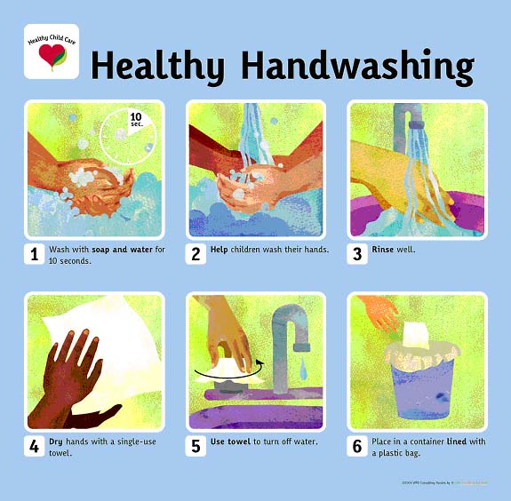
Below are some examples of "How To Posters." I chose the theme of HOW TO WASH YOUR HANDS because hygiene is important. The first two sets are visual demonstrations along with text, but are both lacking in colors to attract the eyes. They still do their jobs of presenting to you how to wash your hands properly, giving you step-by-step along with a photo.


These next two are exactly identical to the first, only that they provide extra colors and visual effects to draw attention to them. I believe this has a better effect in presenting itself and getting the target audience to do as instructed.


All photos are taken from the web. Clicking on the photo and then clicking on original source will lead you to the exact location via the web.

Wednesday, October 19, 2011

2 Point Perspective: Strawberry Concept


This was for the strawberry concept perspective that I had to do for class. After uploading the photo up, I noticed that one of the organic shape was figured wrong, so I digitally corrected, using a different color to show the correction made. The layout was actually in a different format, but I liked how this one look better.

Photo Studies

For class we had to do a series of lighting photo studies.

The first two are examples of interior photos that shows reflections on the floor -
I chose these because they were just fascinating and some of which I took while I was in DC.


The next two photos are examples of vertical reflections. In the first one, the lighting from outside creates a side reflection near the doorway along the window. The second one I thought was cool because it was like a twin building because of the reflection of the angle.


These next two shows shadows entering into a space. I chose them because they each tells a story of their own. They each create a certain mystery to the image.


The last two are examples of artificial lighting. I chose the first image because of the fancy interior layout and how the the lighting created many different shadow textures. The second one is a photo I took of the Rotunda in the West Wing of the National Gallery of Art in DC.


Saturday, October 15, 2011

Assessment of Group

In class Friday, we got into our project groups and was told to choose a photo that we believe our group represented. The following images reflect that of what the IOB group believe we are at the moment.

These first two images represent a wholeness of the group. The two that chose these two images believes that the group is together the way a group is suppose to be. Well balanced and supporting each other was also stated, from the second photo.


These next two photos represent a struggle within the group, whether it's with one another or from outer force, we're still able to maintain the composure necessary to keep going and help each other out in tough times. We might have different opinions at times but everyone continues to work hard for the end goal - together.


The next two shows a similarity in what the two people that chose these said. They believe that the groups dynamic is based upon 3 main group leaders and the rest of the groups members are following them and supporting them.


The last two shows that we're not quite 100% together within the group, but we're working on it. The path that these two shows, if things works out the way it's suppose to, then the puzzle will be fully complete and we'll be as one, while the path of the trees leads to one point in the destination, our main goal for this project.

Thursday, October 13, 2011

Office Space Composition.

Below is the final composition of my office space I designed. The theme was Strawberry, hence the pink theme. I didn't want to go with red as that would have made the space too dark for a first entrance into other spaces. The walls have a soft tan color as I thought this was appropriate for the space. The layout consist of a furniture plan, 2 elevations, and 2 perspectives of the interior.


Business Idea Contest

There is this business idea contest on campus, and I'm currently thinking about entering. I've always been good when it comes to business and this seems to be something quite fun. The top winner also receives $1,000 so that definitely could do quite a few things. You have to come up with an original idea, and if you are selected among the 20 finalist, you have 2 minutes to pitch your ideas to the panel of judges. Talk about do or die. This might even motivate me to get back into the school mode that I've lately feel distance from. Either way, this should be an interesting opportunity that I definitely don't want to miss out on.

Semester Progress

As the semester is already half over, I feel as if maybe I'm starting to slow down. My overall motivation has died out, and just a lot of stress has build up. I'm currently maintaining 3 As and one I'm not so sure of. I know I can do better, but I don't know what is holding me back in that class. But, I will make sure I pass everything; there is no excuse not to. I just need to apply myself for the next month & a half and do well. The final stretch is almost here, I just need to hold on. Sometimes I'm excited for class, other times I'm just over it. Typical college student life, I suppose. Hopefully I can keep my mental focus up and finish this semester out the way I had intended to.

Studio Project - Elements & Principles of Design

As the group project is moving forward as it should, it really has narrow down a bit more towards what we are focusing our attention on. We demonstrated a proportion & balanced of chaotic hexagon shapes design for texture. The form it will take will still depend on the final development of this project as we will continue to work on it. The shadows it cast as of the affect from the lighting of the shape really is quite intriguing, and depending on the time of day, these hexagonal shapes will illustrate a different system of rhythm onto the surface of which it is placed. Overall, we're happy with the design we have completed thus far, and as we have a clearer mindset of what to do, this will only help us to emphasize the importance of our shape in regards to the IOB building and its meanings. The colors we have also selected has a warm & inviting notion to it, as to allow visitors to feel as if they also belong in the place, since IOB has strong family bond towards one another. We will try to explore other colors this week and see where that could also lead us.

Photoshop Composition


Friday, September 30, 2011

Nothing In Particular

I just wanted to take this time to blog about something random, something unrelated to everything, yet it still ties in everything. Lately, studio and other classes has consume the majority of my time, which that's how it should be. If I'm not either working on one assignment, I have many others to partake upon. These blog post are getting quite easy, though, maybe through the repetitive action every week to post up a few. I'm hardly at my apartment much besides the weekend. I used to have time to play some soccer here and there, but with the schedule, it has been a bit difficult. Although, I did managed to play one time this past week. I'm no longer breathing so hard and quick to burn but like in the beginning of the semester. Trying to at least participate in soccer once a week will help me feel better, and allow me to build up my endurance and stamina slowly. I don't mean a quick 30 minute session every time we play either. I'm talking about 2 hours to 3 hours of play every single time. Usually I have a hard time with the first game but as it goes on, I get more energy for some reason. So this will take care of my workout sessions that I no longer have time to do as well.

So, pretty much it looks like it's just going to be Studio & Soccer here on out, until the weather gets too cold to be outside playing that intensely.

I.O.B Progression

The progression of the I.O.B. group has gone in the right direction, I believe. We posted up posted notes on the board to organized our ideas out. After this exercise we set out to make models and pin up, and explore more ideas/concepts with Brailles and textures. Overall, this week has been a success in terms of our progression.


One of the models I made was this wood piece right here. In the beginning, I wanted to place holes into a piece of wood for the Braille lettering and see where that could lead me to. I found an old piece of wood in the wood trash bin and started to drill the holes according to the marks I made on it. I picked out the smallest holes just so that it'll fit on this test board. But after spending some time on it, an idea of placing bamboo sticks through the holes at varies heights came about so I set out to do just that. Smoothing the end product made the wood new again. The little cut wasn't an easy task to cut out with the machines in the woodshop, however. I also chose to do something like this since I knew everyone else would be working with papers and similar materials, therefore I wanted to do something different to add to the group's presentations. I also made another piece, and the texture on that piece is really quite something.

Speech Analysis

To be honest, I believe my speech could have been a bit better organized. I had this pre-set organization going on in my head, and it seemed like the right flow to go at it, but once it was over, and Patrick told me what could have been better, I realized the flow didn't match up as good as I had thought. Although, the layout of the presentation was a great way to illustrated m point and lead into the next setting, I just went about it the wrong way by skipping around.

As for the speaking goes, I can speak in public when I know it's not a given point in time, but when there is one, all these pressure builds up. It's gradually getting better though, and if I practice a bit more I know I can remain calm throughout the whole presentation to do a good job.

The information that the speaking intensive gave was a bit helpful, but since it was given only with a day in advance of the presentation, not everything was taken into consideration when I was presenting. I didn't have time to go back there as well.

The next one will be much more clearer and organized, since I already have some experience with this first one and the nervousness shouldn't be too much anymore. I will also spend a bit more time practicing prior to the actual date so that I will know what and how to address all of my relative information to the audience.

Friday, September 23, 2011

Inferno

Tonight, my crew & I are hosting an event @ Inferno downtown Greensboro. Inferno is one of the hottest clubs in Greensboro, and we have the privileged to own the place for the night. Usually we host special events like these over @ Greene Street, but we're switching it up and making things more interesting this time around. We get to invite all our friends out for a good time, party, dance, and actually make money as well. Making new connections around town, as well as developing human relationships is a bonus to these events. I enjoy it, but sometimes during the working hours into the night, I have to work more than I can party. But hey, this is for the people that comes out, and if they're having a good time, I'm having a good time. Usually our events are somewhere between 350-600+ people. I know, that's quite a good number of audience. We're becoming quite well known in the club industry, and soon we'll be on contract to host monthly promotions! Now it's time to go get some errands done and get ready for tonight. :D

P.S., I wanted to write this before I go out tonight, in the event that I am too unstable tomorrow morning to write about the actual event itself. Ya knowwww what I'm sayyyyingg?

Color Studies

This week, we got our color studies back from last week.


I just wanted to blog about this because, whenever we do something with colors, I enjoy it very much. I believe I have a good sense of colors, what goes with what, and what could be used to highlight certain areas, or even to bring out certain hues in another color. I got an A for this assignment in History class so the work I put into it was well worth it. I just enjoy colors overall, and I think more people should embrace colors more often. They are too shy, or don't want that kind of attention drawn to them, but I find it, the more colorful you are, the happier everything else seems to be as well! :)

Photoshop'ing!

The image I choose to recreate is of the following:

I took this on my X10 Android phone. The scenery was very pleasant that day, and the view was just amazing.

The next two photos I found on google, (link to direct sites at the bottom). I'm very interested in the club scene, since I do promotional events for them, so I opt to go this route.


The final product:


The first photo I chose was a daytime photo, the perfect weather condition for site seeing. As I incorporate my style and nightlife into the photo, I chose to make it seem like one of DC's hottest club, with the rays of lighting coming out from the open window in the building, and casting a magnificent glow onto the water. It's like one of those rave parties with neon lights all around. Good DC by day, gone bad by night ;)

Wednesday, September 21, 2011

Powerpoint Presentation


I visited 2 museums; The National Gallery of Art that was divided into two section, the West Building & the East Wing. The other museum was the National Museum of African Art.

The layout of my power-point presentation not only depicts the circulation order of my visit, with the West Building first, leading to the East Wing, and finally to the National Museum of African Art, but it also captures what I found most fascinating in the spaces, or the actual space itself.

In the West Building of the National Gallery of Art, the Rotunda structure stood out in my mind the most, with its replica dome. The space it capture in there seems to extend far into the space of the building. When I moved towards the East Wing, the grand scale of the area was magnificent. The space itself was breath taking. I especially enjoyed the openness of the space, along with it's play of color pieces that darts your eyes from one area to the next. But a certain circulation pattern also form up this huge space: The many stairway levels of the space, the actual levels themselves, and the hidden spaces/room that each levels branch off from. The last place was the African Art Museum, where I found the Bololo art piece to be most intriguing. The organic space occupied the space of the exhibition in a way that just completely stood out from the rest as you first enter into the room.

Overall, I quite enjoy my visit to all the Museums in D.C.

Below are links to the photos of the power-point:

http://www.dcbestbets.com/National_Gallery_of_Art.jpg

http://www.maletphoto.com/Art/Art/IMG1969-1/1195499130_DC9Z5-L.jpg

http://www.raphaelsk.com/wp-content/uploads/East-Wing.jpg

http://www.flickr.com/photos/kevharb/4183169680/sizes/z/in/photostream/

http://upload.wikimedia.org/wikipedia/commons/archive/e/e5/20081024111326!National_Museum_of_African_Art_DC_2007_003.jpg

http://www.tbd.com/blogs/tbd-arts/2011/02/the-national-museum-of-african-art-launches-africa-underground-series-8703.html

New Ideas


These are some of the office reception desk I found interesting, that I might convert into my own space. Links below leads to the actual page I found them at.

http://www.pevarnik.com/Recdesks.html

http://www.officechairsdesks.net/reception-desks/

http://www.lamercanti.com/static/landing/img-landing/italian_reception_desk.jpg

http://www.browercreek.com/photos/laserglass-reception-desk.jpg

Perspectives


Office Space, 20' X 20'.

Friday, September 9, 2011

YES! I.O.B Project

Yes! I got the project that I wanted to work on most this semester, which was the Industrial of the Blinds. This place is just full of inspirations and will definitely motivate me to come up with something meaningful for them. When I heard my name called out during the group selections, I wouldn't help but say "yes" out loud after knowing I was in the project I wanted to be in. There are some great people in my group as well, and I believed we'll have an amazing time all working together in this fantastic project.

We assigned a group leader, which was Katie, and listed other things we needed to address. I feel comfortable talking and communicating in this group, and I believe there has to be a certain comfort level in order to do well with group settings. I'm just happy I get to do a meaningful design first this semester before anything else, so that my motivation doesn't disappear halfway through the semester! =)

Group Work

Spending Wednesday of this past week in a small group of 3's, we discussed the main ideas and components of the three sites we have encountered thus far. We talked about the materials, and what needed to be created for the WAM Cabinet, as well as how to get it more noticeable. Then we moved onto the Greensboro Historical Museum and listed things we didn't like it about/changing certain things up. How the sense of flow in that building was lacking, and hard to figure where to begin first. The last thing we discussed was the Industrial of the Blind, my favorite one. We were giving suggestions on how the lobby space should be and that it should create a story within the lobby and outside area so that audience would know before even going deep into the building.

Below is an image I took from my phone of our 18x24" discussion for Wednesday.


After our small discussions in group, we had to visualize it and transport it onto a bigger sheet against the wall to present. It was actually fun, seeing everyone working together in groups and doing the same thing. It was like a contest or something. I'm also glad to see that everyone pretty much had the same ideas and concerns for each place. It was a good way to strengthen group work from the start. I enjoyed it.

Thursday, September 8, 2011

HEADER

The beginning of the semester, we were asked to make a header for another student in our class. We got together with the other person and wrote down some general ideas and concept of what appeals to the both of us. My general understanding of my client was that she was interested in dream catcher, and a few colors like, purple, white, & gray. So with these combinations, I set out to make a dream catcher and incorporated these colors within it. The following image below is the finishing product. This was my first time making a dream catcher, and I'll indeed will try my hands at this again.